Correcting an ill-suited addition from the nineties, this mid-century home in a little pocket of Victoria has been lovingly restored and updated by Drawing Room Architecture, giving the Frank Lloyd Wright inspired gem the respect it deserves.
Built in 1966, this stylised home in Frankston South was designed by Ian Banner of Chancellor and Patrick. Along with Australian architectural greats like Roy Grounds and Robin Boyd, Banner introduced the country to the international style that would eventually develop into bold mid-century designs, such as their celebrated Butterfly House in Dromana.
Externally, the façade is broken up by evenly placed brick columns (the Lloyd-Wright influence in full effect) and the low, split-level silhouette, synonymous with the time. This design choice works in harmony with the landscape, creating elements of interest and intrigue in the interior. The original footprint of the home was smaller, featuring multiple living spaces but only two bedrooms, its emphasis on entertainment and leisure.
Over the years, there have been updates performed with the aim of enlarging the home, including a carport-turned-master-bedroom, and a clumsy rear-attachment in the 90s - the latter of which sparked consternation for the new owners. Built without consideration or respect to the building’s idiosyncratic style, it was at odds with the original vision. When the property changed hands, it did so, thankfully, into the loving embrace of mid-century architecture fans.
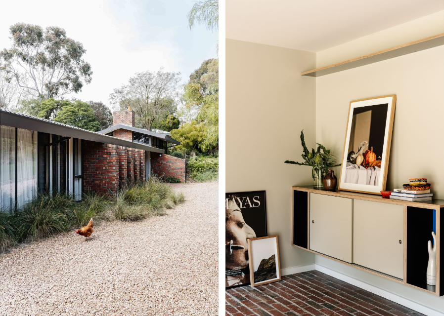

“Mid-century means bold colours and robust, humble materials, and a bit of thought to settings. Mid-century does settings really well,” says Nicola Dovey of Drawing Room Architecture. “We gave every corner a setting,” says Dovey, “that’s the reading area, the fire nook, the family nook, then there’s the pantry and the crafting corner. That’s where the record player is, that’s where the books are…”
Thanks to original home’s material taxonomy, it already confidently expressed itself in exposed brick and timber framing. Along with contrasting, poppy colours and plywood cabinetry, it gave Drawing Room Architecture plenty to work with. Sitting amongst eucalypt and coastal grasses, feelings of Arts and Architecture’s famous Case Study Series in California come to mind.
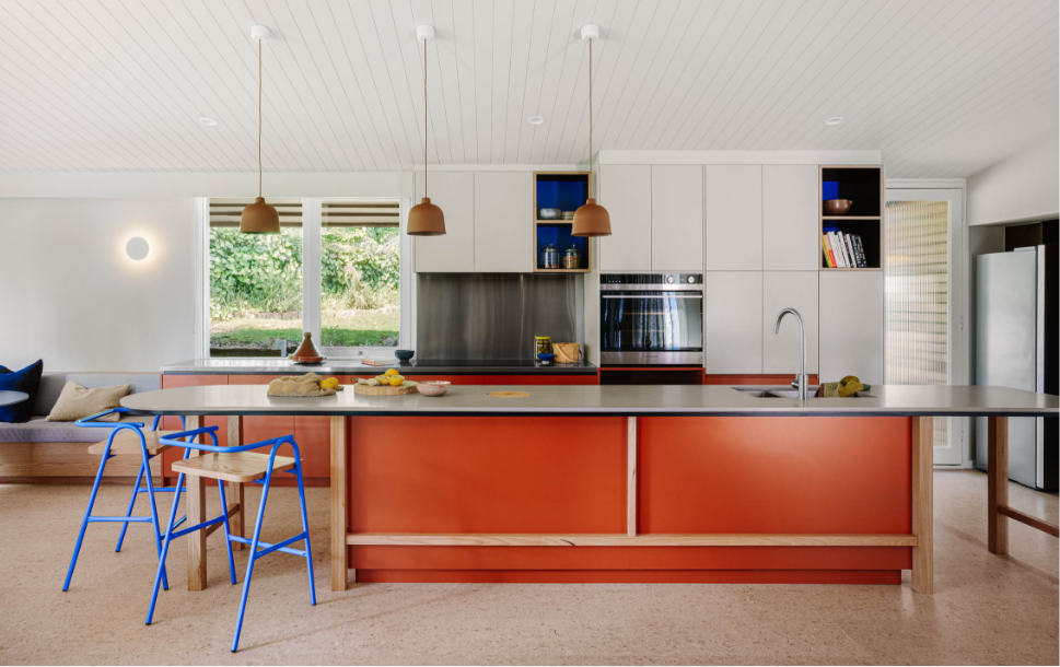
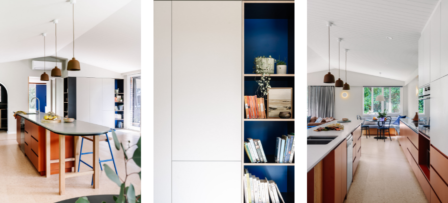
Tying everything together, in both design and function, is the oversized kitchen island. It’s hard to miss in Laminex Moroccan Clay with exposed timber battening, both of which are cheerful nods to the original cabinetry and palette. It’s a space to gather, interact, participate and view, and is the literal hub of the home. At one end, a dividing wall between the kitchen and dining rooms offers a retractable door as a playful homage to the 60s and the many cocktail parties likely held in spaces such as this. Painted in Dulux Orangeade, it continues the parade of humble materiality that pervades Mid-century Modernism, enveloping all that enter with its warmth and crafted beauty.
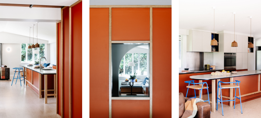

“[Modernism] was democratic and there’s something fabulous about that. You can see how it’s made; you understand it, you get it. And so, the battening was designed to work with the divisions you see in the windows of the original façade, working in similar proportions, bringing it all in,” explains Dovey.
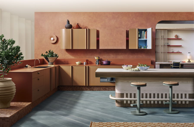
Laminex Paper Bark was used for the upper stretches of kitchen cabinetry, lending a calm contrast to the brighter tones of the space’s palette. Matching the front door - another great demonstration of consistency and theme - bright Laminex Olympia Blue is used, in a perfectly apt reference to the celebrated design duo Ray and Charles Eames, and their love of readily available materials (Laminex Olympia Blue has since been discontinued, please see Laminex Portsea as an alternative).
“First thing I thought was it must be Laminex and have those strong colours. I know that as a material, it can be a bench top, a face, it can be skirting, it can be anything. It can go anywhere, and when it’s got that colour, it’s perfect. There are no issues with how it’s cut, it’s just strong, robust, and beautiful,” says Dovey on why specifying Laminex works on so many projects.

Mid-century design was the culmination of many things, but is an aesthetic we still project onto this time and place, and one we continue to hold dearly. Still associated with the new, the modern, the future and the next, mid-century aesthetic homes are – when executed properly – still the standard bearer of class, style and an ideal version of living.
As Dovey highlights, what this period of design did so well was create moments. Never novel, the fun was taken seriously. Palettes may be bold and characterful, but they served pragmatic purposes. Often crafted by hand, the humble nature of the materials had space to age and develop, something that can be seen in the original rooms of the house. Through a thorough understanding of these design principles, Drawing Room Architecture were able to quietly yet successfully apply 21st century sensibility and usability to the project, while remaining faithful to Banner’s original concept.
Learn more about this project, and Drawing Room Architecture’s design portfolio, here.
Credits:
Architecture + Interior Design: Drawing Room Architecture
Build: Buena Vista Homes Australia
Photography: Marnie Hawson
Styling: Belle Bright Project


