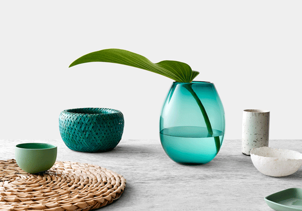
We asked Patrick Kennedy, Shaun Carter and Catherine Valente to tell us about their approaches to colour, and how they reconcile trends with project longevity.
Patrick Kennedy and Shaun Carter are leading architects, Catherine Valente is Laminex’s Design Marketing Manager, and all three lead professional lives immersed in design and colour. Here, they give some insights into how they think about colour, and how they produce work that captures the zeitgeist but isn’t beholden to it.
Patrick Kennedy from Kennedy Nolan Architects
Colour is extremely important to us. We start talking about it from the very beginning of the design process, sometimes as a touchpoint for everything else in the project.
We like to hit things hard with colour. Often in our houses, you’ll see rich blues and greens, and that comes from our interest in the arts and crafts movement, which uses a lot of saturated colour. But then different situations will suggest to us an absence of colour, and we’ll use a lot of white, a lot of texture. So each project demands its own approach to the use, or lack, of colour.
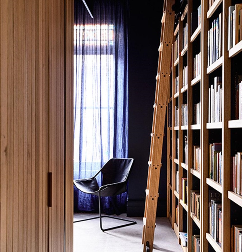

There are definitely trends in colour, and I enjoy seeing what comes in and out, not just in architecture, in fashion and advertising and everything. But what really matters is the application. We’ve been using a lot of these rich reds and terracottas, for example, which are more popular at the moment. But we don’t apply them to every project. They have to be part of an entire colour palette, all working towards the same thing.
I remember a few years ago, canary yellow was the colour. It’s great but people just used it on everything. Too often it just didn’t look right and those applications haven’t aged well. If you use colour in a very authentic way and it feels natural from the start, you tend to get a lot more longevity out of it.
Shaun Carter from Carter Williamson Architects
We love the modernist idea that if you do colour, you do it completely. So if it’s going to be a wall, it’s a wall of colour. If it’s going to be an object, it’s all the one colour. We try to keep it as pure as possible. But for each client, each project, we develop a particular design response and it generally has a colour associated with it.
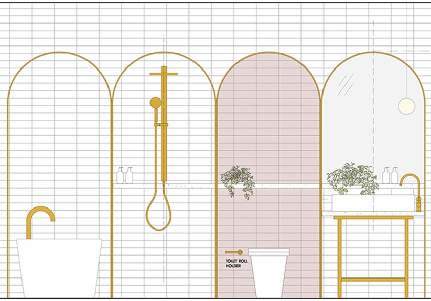
At one of our current projects, we’ve thickened the wall in the bathroom to create these lovely little arched nooks where a basin or a toilet pan, a shower or a standalone bath sits. We’ve then picked one out and applied a really soft pink tile to it. It’s a shot of colour in this white marble bathroom, a special little moment. In fact, we’re a little bit in love with one particular porcelain tile right now. It has a really rough texture but comes in these beautiful washed-out colours. Pastels, essentially. We’re bringing back the 80s!

In terms of trends, as architects we’re all looking at each other’s work. We like to think that we’re running down our own little paths of development, but those paths intersect and overlap with those of our contemporaries. Take the pastels, for example. Almost by osmosis you start looking at them and going, “Well, it’s these colours that I prefer.” But you’ve essentially been predisposed to liking it because you’ve seen it two or three times in great applications. So you’re always working in a milieu, and our use of colour reflects that.
Catherine Valente, Design Marketing Manager at Laminex
Trends are important as a source of inspiration. They should challenge us to think outside of our everyday life. But instead of speaking to our customers about trends, we prefer to establish a forecast – a range of palettes that can be adapted and mixed. I want people to see what’s possible and then take away what is suitable for them.
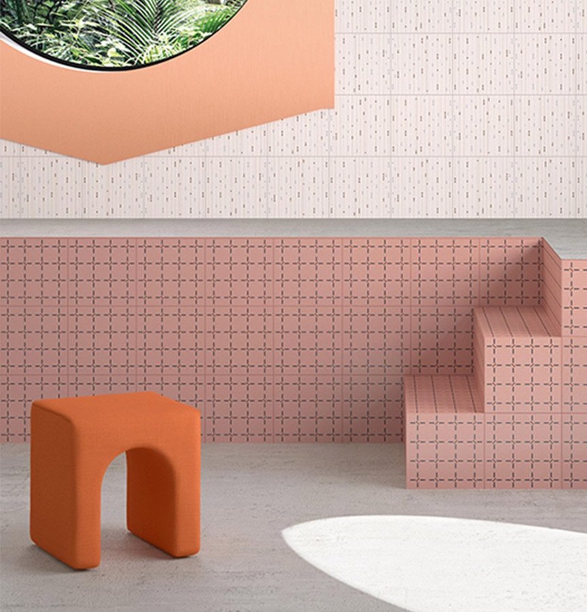

When I speak to homeowners, I say that establishing a core base palette, a perfect summary of their personal style, is key. Then they can add touches of trend-based colours through items like soft furnishings, artwork or a painted wall, without significant expense. And I always suggest choosing colours inspired by our natural landscape. Our love of the outdoors is a constant.
But colour absolutely goes through cycles. When a new version of a colourway comes in, if it's relevant and adaptable it will stay popular, or it will branch off into different variants. Acid yellow was big a few years ago, but it quickly branched into canary yellow and now has transitioned into a more appealing egg-yolk yellow. Texture is crucial in design too, especially when using limited colours and neutrals. For example, tone-on-tone is a strong trend at the moment, so texture plays an important role there.
Laminex’s job is to develop products that enable architects and designers to explore all of these options. I ensure that we’re aware of all the global trends but I also take inspiration from adjacent industries – flooring, tiles, tapware, timber, furniture, paint and fabrics – because it’s crucial that we respond to trends in a way that’s relevant to Australian design and the places where our products will be applied.


