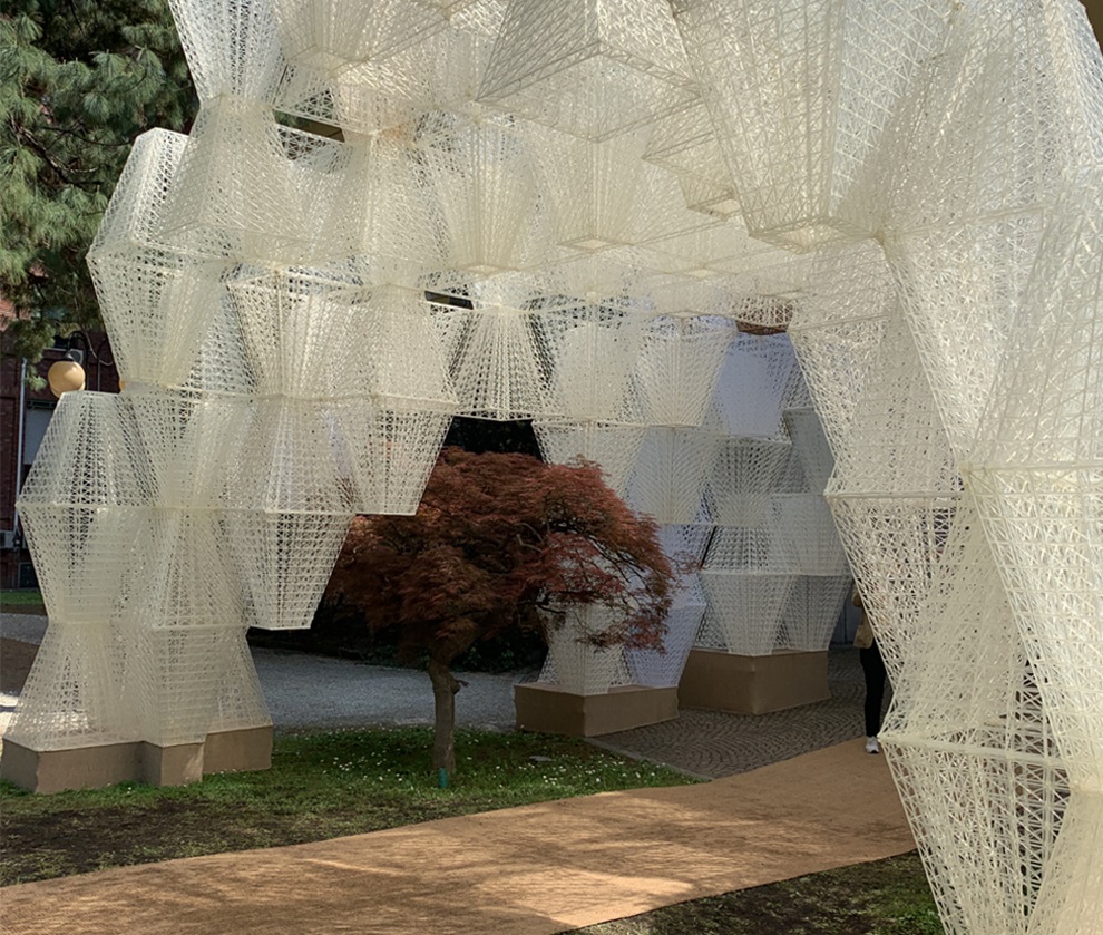
Here’s our summary of the colours, materials, textures and interior style trends to emerge from the annual design event.
The stream of beautiful Instagram images might slow down quickly after Milan Design Week wraps up, but for trend forecasters like Bree Leech, that’s when the real work begins, analysing and contextualising the themes that played out at Salone del Mobile and the many installations and pop-ups that surround it. For this year’s iteration, Laminex asked Leech to report back on the emerging movements that might influence how architects and designers work with surface materials through 2019.
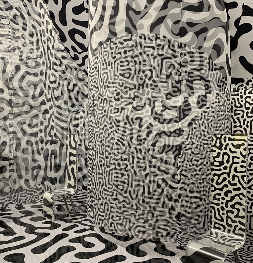

The colour evolution continues
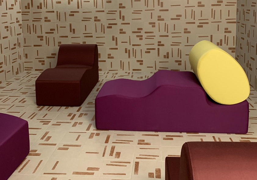
The colour palettes on display in Milan were warmer and softer than last year, but it’s clear that rich colours are still very much at the forefront of designers’ minds. Whites were rarely seen and while cream featured in multiple displays, it was mostly as textured upholstery. Neutrals were more heavily influenced by pink and purple palettes and there was also a strong return to brown, either rich and reddish or more like tobacco.

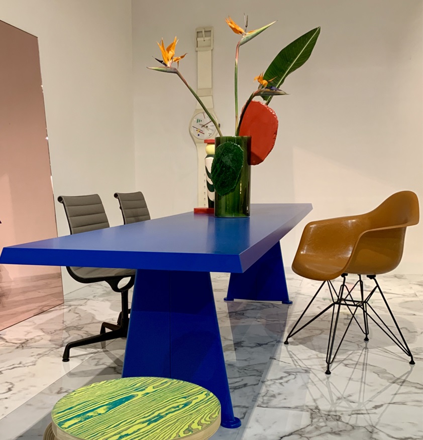
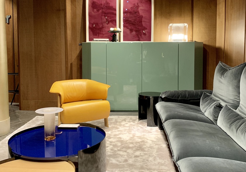
Blues were everywhere, mostly in denim and indigo tones, with a common purple undertone that linked through to the emergence of moody aubergine, royal purples, softer mauves and lilacs, and, especially, various shades of grape. However, one of the standout colours across the entire week was International Klein Blue. “Its bold vibrancy lifted many interiors,” says Leech, “and worked with other colours such as red, green and gold.”

Greens increased in prominence again on last year’s showing. “Greyed-off green was the most popular background colour used on walls and floors,” says Leech, “and greens were often used together. Accompanying a grey-green base we saw forest, olive and avocado.” Soft silvery green and sage were also popular.
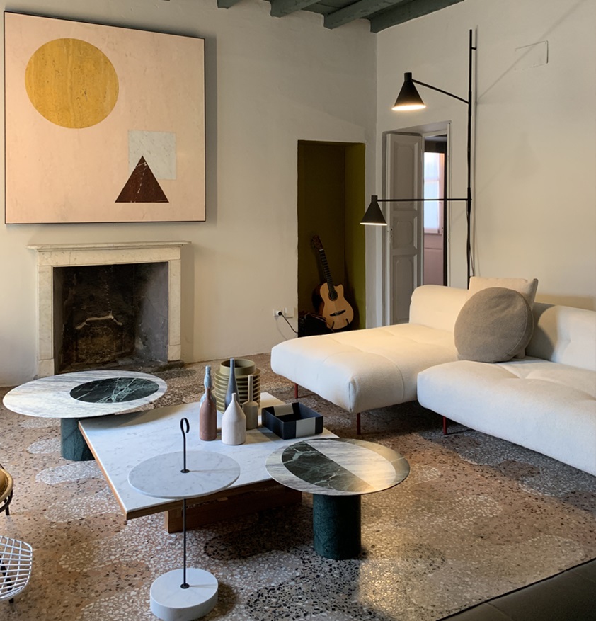

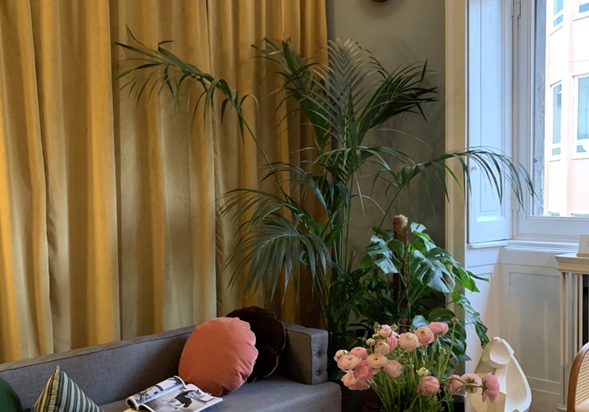
Other key colour themes were the continued rise of yellows – particularly mustard, egg yolk and citrus – and the disappearance of millennial pink, replaced by soft coral, salmon and terracotta. Pastels were “muted, greyed off and often dirty,” with the most popular colourways being soft clay, lilac and powder blue. And as a highlight, bold red emerged as a favourite. “Red went hand in hand with other warm hues, ranging from burnt oranges to brick, with hits of a brighter red in small doses,” says Leech. Emerging colours to watch for next year include soft melon, pinkish tan and burgundy.


The role of texture and materiality
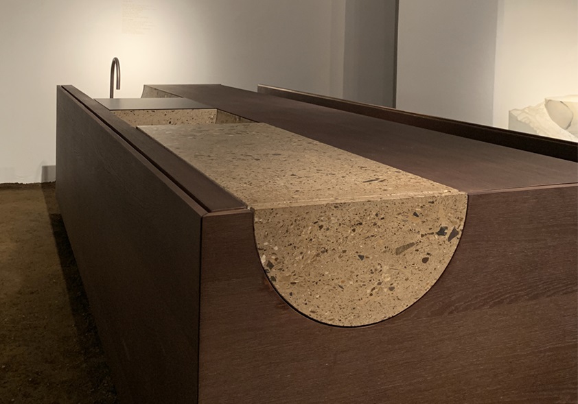
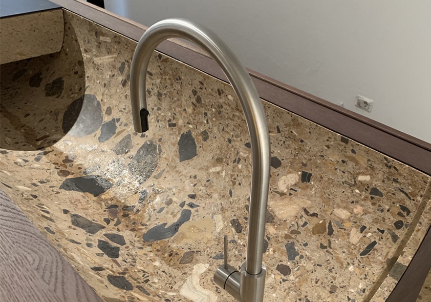
The textural beauty of terrazzo continued to be popular, not only in solid form but printed or as a pattern on textiles. For example, the Nuances rug range designed by Patricia Urquiola for GAN uses sustainable felt to create a distinct terrazzo look, while other brands, including Cassina and Moooi, showed furniture upholstered in terrazzo-like flecked fabrics.
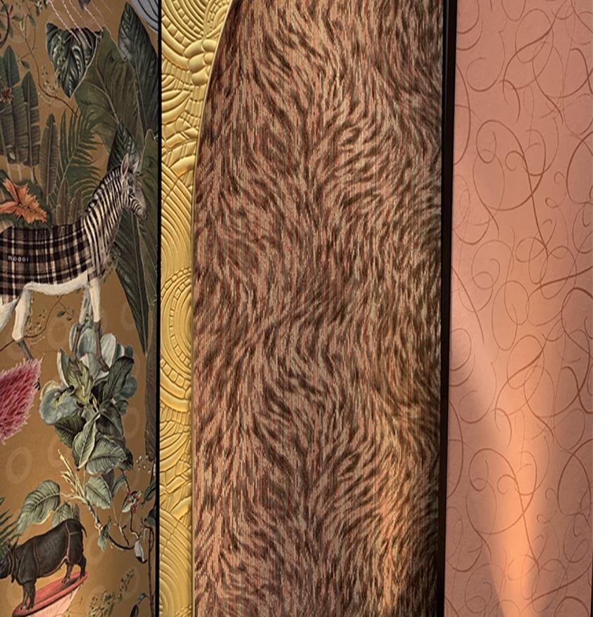

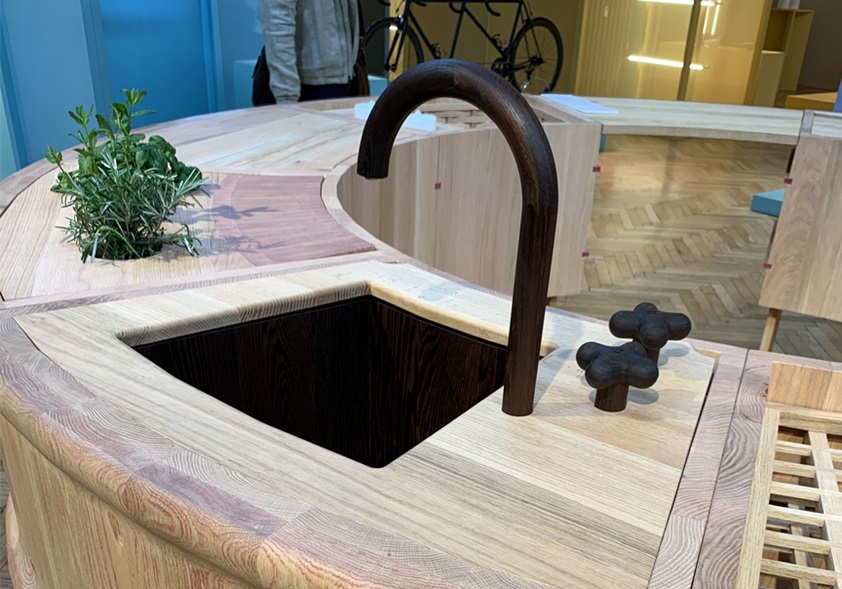
Timbers were popular but with no definitive movement in any one direction. “Mid-brown timbers and black-stained timber most prevalent, but not by a lot,” says Leech. “Timber grains weren’t as striking as last year and tended to be subtle and linear.” However, one emerging trend was for coloured stains on timber that retained woodgrain as a feature.

Themes in interior styling
A strong Japanese influence was at play, from details such as oversized paper lanterns and watercolour prints at the Arper stand and Zanotta’s sculptural floral arrangements, to architectural elements like Kartell’s shoji screens. However, the 100-year anniversary of the founding of the Bauhaus saw just as many design brands pay homage with strong black-framed graphical shapes and classic Bauhaus primary colours.
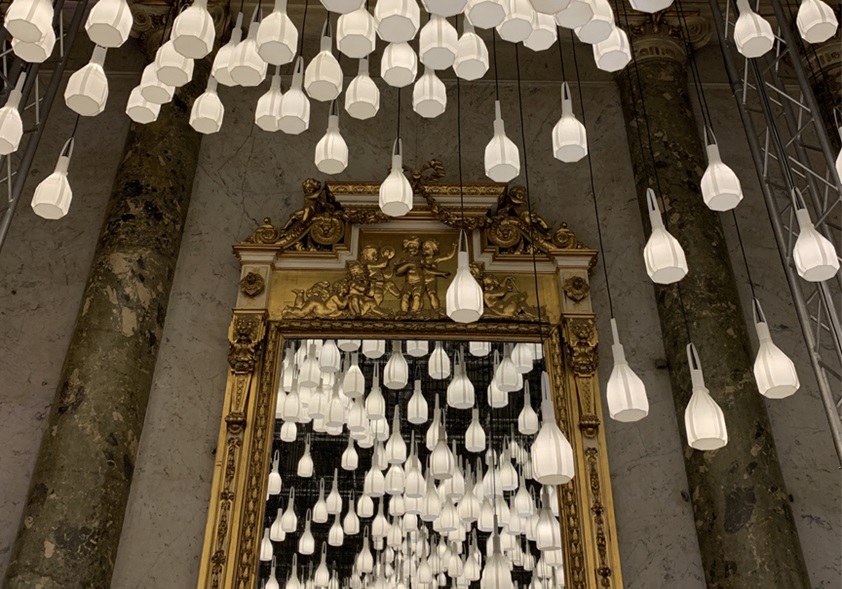

Leech also spotted a more fundamental design theme. “The strongest direction in furniture form was curves,” she says. “Voluptuous shapes were seen in sofas and chairs.” And those curves extended to the physical spaces as well. “Edges were rounded, walls were half circles.” Combined with the warmer, softer colours on display, it seems to have given Milan Design Week a somewhat organic, approachable feeling. It’ll be fascinating to see how that plays out in architecture and design over the coming year.


Correlation with the Laminex Colour Collection
There are direct correlations between the colours and textures seen in Milan and specific decors in the Laminex Colour Collection. The “greyed-off green” of organic muted greens like Laminex Seed and Spinifex, for example. And the terrazzo flecks of Laminex Tonal Paper Terrazzo. But more important is the way that the Colour Collection will work with the featured colourways from Salon del Mobile, when they appear in new design projects here, in wall colourings, soft furnishings and the like. The realistic woodgrains, mid-tone neutrals and rich cream-based whites in the Laminex range will provide a sophisticated supporting palette for these saturated, high-contrast hues, enabling architects and designers to create interiors that are both contemporary and enduring.
You can read more about the development of the Laminex Colour Collection here.


